In the development of this case study over the coming weeks, I’ll be looking to implement a number of accepted design principles while detailing the role that design can have within the Public Relations industry. I’ve considered my options with regards to the medium that I feel will best represent the design direction I’m looking to take, and have decided that the appropriate format is most likely a newsletter. This has been chosen for initial exploration as I feel it will allow me to express the content and aesthetic design in an uncomplicated and thoughtful manner.
Past examples have shown that the idea of clean, minimalist design can be very effective in this industry. M&C Saatchi are an established advertising and PR agency. Their use of bold, confident design on the webpage interface creates a sense of sophistication and a discernment for the intricacies of the trade. Given that at the heart of Public Relations, it is essentially ‘public perception’, the aforementioned qualities exude a powerful message to any potential client.
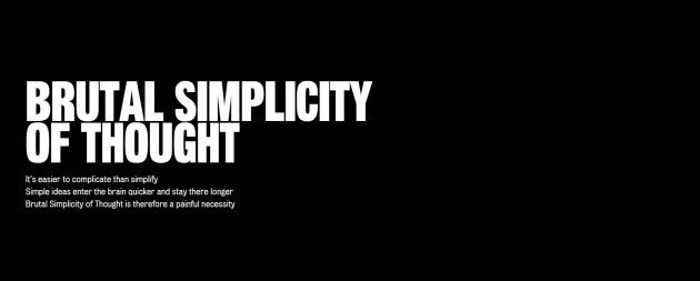
This style follows some very important design protocols. It’s straightforward and eschews anything ornate such as a serif font to align itself with the concept of ‘form follows function’. It’s simplicity also allows it to be easily implemented across a broad range of mediums, from print to web. Furthermore, the use of a monochrome scheme may lack a certain degree of vibrancy, but it paves the way for subtle uses of colour to add extreme emphasis. I’ve attached a very rough draft of a possible direction.

References:
M&C Saatchi n.d, Brutal Simplicity of Thought, M&C Saatchi, viewed 15 November 2015 <http://mcsaatchi.com/principles/brutal-simplicity-thought>
Lidwell, W, Holden, K & Butler, J 2010, Universal Principles of Design, Revised and Updated : 125 Ways to Enhance Usability, Influence Perception, Increase Appeal, Make Better Design Decisions, Rockport Publishers, Massachusetts USA.

Absolutely love that first image in your post Michael! The process for your design sounds very professionally thought out and feasible. I look forward to taking notes from your work!
LikeLike
Thanks Sophia! The first image is just a screenshot off the Saatchi website, it’s all laid out like that. I’m going to go over and take notes on everyone else now too!
LikeLiked by 1 person
I like the bold idea! It is all about perception, and i definitely agree people will stop and read your message when presented like this. Great work Michael.
LikeLiked by 1 person
Cheers Luana!
LikeLiked by 1 person
I like the simplicity of your idea too Michael, Brutal Simplicity of Thought is a great example of form follows function. Your draft sketch really comes to life too. I look forward to seeing what you develop.
LikeLiked by 1 person
Thanks Deb, already having second thoughts on the sketch though.
LikeLike
Really well structured and written post Michael. You have ticked all the boxes, beginning with a well referenced critique of your design example which follows into a clear outline of how this analysis will influence your design choices. Your design draft is at a great stage, thinking about overall layout and hierarchy which will allow you to focus on the basic needs before the higher ones.
Following this formula in future posts should set you on a clear path for steady development of your design process over the Assessment requirements.
LikeLike
Good to know I’m travelling ok, thanks for the feedback Carla. I have a few questions I’ll email soon.
LikeLike
No problem Michael, please do.
P.S. We have decided to release numerical marks for the first blog posts, just to give an indication of your progress before the census date. You scored a 5 out of 5.
LikeLike